
Business attireThe psychology of color lies in people’s symbolic association and mental experience of color. The symbolic association of color refers to people’s psychological response to color, which also becomes people’s visual function experience. Wearing appropriate and colorful professional attire can make people happy and improve work efficiency. This is people’s mental experience about color. Several main psychological associations about colors are as follows: (l) Cold and Warm
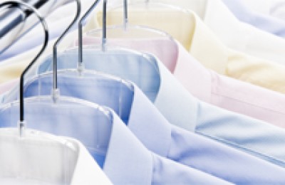
Visual colors can arouse people’s psychological associations with cold and warm feelings, which are reflected in clothing. Warm-colored clothing has a lively and warm feeling; Warm-colored clothing makes people feel colder. This kind of psychology can be used in the design of business attire. Managers use warm colors to express a rigorous and meticulous work attitude, and service staff use warm colors to make customers feel intimate and happy. High-purity blue is calm and solid, expressing a sense of the future and technology, and is often used in the communications industry with high technological content.
(2) Calmness and Noisy
Colors can give people feelings of calmness and noisy, which can bring about active or depressed moods in different environments. It is related to hue, brightness, and purity, among which purity has the greatest influence. In terms of hue, red, yellow, orange and other colors make people think of fire and the sun and feel excited; blue and green make people think of the ground and sea water and feel peaceful. When used in clothing, work clothes in entertainment venues mostly use calm colors, while doctors and nurses use quiet and noisy colors.
(3) Gorgeousness and simplicity
Color can give people a sense of magnificence, or it can also give people a sense of simplicity. Purity has the greatest impact on people’s psychology among colors, followed by brightness and hue. In general, rich, gorgeous and bright colors are gorgeous, while pure, turbid and dark colors are earthy. In addition, the gorgeousness and simplicity of colors are closely related to the matching of colors. Generally, those with stronger contrast have a sense of luxury, while those with weaker contrast have a sense of simplicity. This characteristic of color is also closely related to the place where the clothing is worn. For official business, finance and other industries, simple colors should be used, while for hotels and airlines, more luxurious colors can be used.
(4) Lightness and stability
This feeling mainly comes from the brightness of color. Colors with high brightness give people a sense of lightness, while colors with low brightness give people a sense of weight. In terms of clothing matching, if the top is white and the bottom is black, it will make people feel stable, solemn, and precise; while the top black and bottom white will feel light, flexible, and agile.
(5) Vividness and severity
Warm colors, colors with high purity, colors with strong contrast and colorful colors appear lively and vivid; warm colors, dark colors and gray give people a sense of severity and seriousness; Black gives people a sense of oppression. Gray is neutral and white is vivid. The vividness and severity of color are similar to the calmness and bustle of color. It is used in clothing colors for different ages and positions. Generally, young people’s clothing has more vivid colors to show their sluggishness, liveliness and cuteness; while serious clothing is suitable for middle-aged and elderly people to show the childishness and stability of the wearer.
The psychological effect of color can strengthen the professional atmosphere, silently standardize the professional requirements, not only make external staff more aware of the nature of their work, but also satisfy the psychological needs of customers and audiences.
The psychology of color refers to the stimulation and various reactions caused by color on human psychology and nervous system. There are visual balance scenes, contrast scenes, illusion scenes, and various other feelings and emotions, etc. Understanding the visual perception of color is of great significance to studying the design of professional attire colors.
(1) Visual balance phenomenon
Colors in nature stimulate people’s visual organs to produce color sensations, causing the brain center to produce physiological balance needs for color. Under certain circumstances, the color of clothing can bring different physiological responses to people. For example, the bright, gray, light and dark colors will affect the mood of the worker, increasing or increasing the worker’s sense of fatigue, boredom, restlessness and calmness. In the medical industry, color design consists of a series of light pink colors that are comfortable, comfortable, clean and hygienic, as well as white and warm colors, which have obvious auxiliary therapeutic effects.
(2) Visual contrast phenomenon
Visual color contrast phenomenon refers to the contrast between colors that occurs when the human eye is stimulated by different colors. Two colors appearing at the same time will change the original physical feeling and develop in the corresponding direction. When white and black are put together, white is whiter and black is darker; when red and green are put together, white is redder and green is greener; when warm colors are put together, warm colors are cooler and warm colors are warmer; gray and brilliant colors Put together, the gray ones are more gray, and the bright ones are more gorgeous. Applying this color rule to the design of professional attire can make the clothing more eye-catching and decorative according to different needs, or avoid excessive contrast and make the clothing more restrained and subtle.
(3) Visual illusion scene
Color is represented by the shape of the object. Any object has its space, position, size and shape, etc. The differences in these factors cause changes in the hue, brightness and purity of the color of the object. These changes often give people the illusion of color. In clothing design, vertical lines, small patterns, warm colors and bright colors are often used to change a body shape that is too short or too fat, or horizontal lines, large patterns, warm colors and bright colors are used to compensate for the lack of a slender body shape. .
�When the human eye perceives a color, it always needs the complementary color of this color to restore the original balance. In clothing design, people often use this illusion to enhance the beauty of skin color. This is why suitable clothing colors can make people look energetic, while inappropriate colors can make people look dull and listless.
Studying the rationality of clothing colors and applying them rationally in the design of business attire is a very important topic.
6. The environmental nature of color
Clothing is worn by people, and people are the main body of the environment, so the color of clothing is inseparable from the living environment. Society is the space and background for people’s activities. In other words, clothing color is part of the overall color of social life. The color of clothing is affected and restricted by the color of the social environment. This is the environmental nature of clothing color.
Business attireThe color is much more restricted and affected by the environment than ordinary life attire. In different task environments, two aspects can be analyzed and considered. One is to think about the nature of the industry. For example, a fast food restaurant should use clothing with high brightness and purity to make customers feel nervous and happy and increase their appetite; while bank staff should use gray clothing with low lightness and purity to give customers a sense of stability and stinginess. The second is to consider the decoration style of the workplace. For example, in a high-end office building with elegant and grand decoration, you should choose some matching gray series of clothing; in a resort-style leisure hotel or restaurant, the waiter’s clothing can also be combined with some bright colors with a tropical or rural style.
Business attireThe beauty and unbeautifulness of colors must be combined with the above two aspects and must be carefully considered. Colors that do not meet the requirements of the nature of the industry and are incompatible with the same working environment are not acceptable. It will make people feel beautiful.
7. The popularity of color
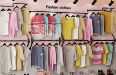
Popular colors have always been the most sensitive and concerned things in people’s lives. In the market, the price of clothing of the same specifications and texture, in popular colors and outdated colors, can differ several times or even dozens of times. When a color becomes popular, it will set off a wave of beauty enthusiasts abandoning the old and replacing it with the new. It can be seen that popular colors play a huge role in accelerating and prolonging the consumption cycle of clothing and the high economic value it adds.
The colors of Business attire also have this characteristic, but under the constraints of its inherent characteristics, it needs to be a little more subtle. Generally speaking, the colors of business attire rarely follow the popularity of a certain color directly, but adopt some neutral colors in the general popular environment. For example, from the popularity of navy blue in the early 1990s to the supporting role of gray today, the popular colors it chooses are always safe and classic.
When used in specific design matches, popular colors can be used in conjunction with industry characteristics. In some more trendy and advanced industries, popular colors can be used as the main colors, and the matching decorative colors can be harmonious and harmonious; in some more conservative industries, common colors with low lightness and low purity can be used as the main colors. Appropriately use popular colors for decoration in parts. This is both strict and generous, and can also express certain popular ideas. This article is copyrighted by Guerlain Business Wear. Please indicate the source when reprinting. Thank you for your cooperation!
Tag: